
















The turni calendar fills the screen
The person who asked for the swipe wrote again, with a screenshot and two ideas. What came out of it was a wider pass over the interface than we expected.
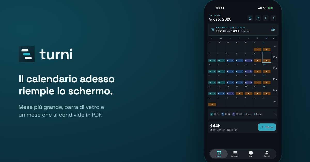
The turni calendar on iPhone and iPad now fills the whole screen. The weeks take the space that is left over, the month reads larger, and the empty area that used to sit below it is gone.
The tab bar has become properly translucent, with content flowing underneath it instead of stopping above a flat band.
Where it came from
From the same person who suggested swiping between months in the first App Store review. They wrote again, this time by email, attaching a screenshot of a defect in the Profile summary and proposing two ideas.
The defect was real. With a long shift cycle the panel at the top of Profile came out clipped at the sides, and anyone running a cycle of twenty or thirty codes saw it every time they opened that screen. It is fixed, and the codes that do not fit now become a counter instead of being squeezed until they disappear.
What else changes
Tapping Mese while you are already on the calendar brings you back to the current month.
The month title always keeps the same size, so the calendar no longer shifts when you move from September to October.
The share button produces a PDF instead of an image, ready to print and to file.
And then alignment, sizing and spacing in a good many places, including the first-run screens.
Why we are telling you
Because this is the second turni update in a row that came from someone who uses it every day. Write to info@systema360.it, we read everything.
Related articles
 Featured
Product updates
Featured
Product updates
acepoint
Court lights that switch on by themselves
With the devices installed at the club, acepoint switches the floodlights on when the sun goes down and off when the booking ends. Surcharges for lights and heating are already available to every club and, once set, are added to the price automatically.
Read the article Featured
Product updates
Featured
Product updates
doculea
Doculea is available on the Mac App Store
Version 1.0 of doculea is on the Mac App Store. It reads documents on your Mac, suggests categories, dates and tags to confirm and files them with rules you choose. You start free, with up to 20 individual documents.
Read the article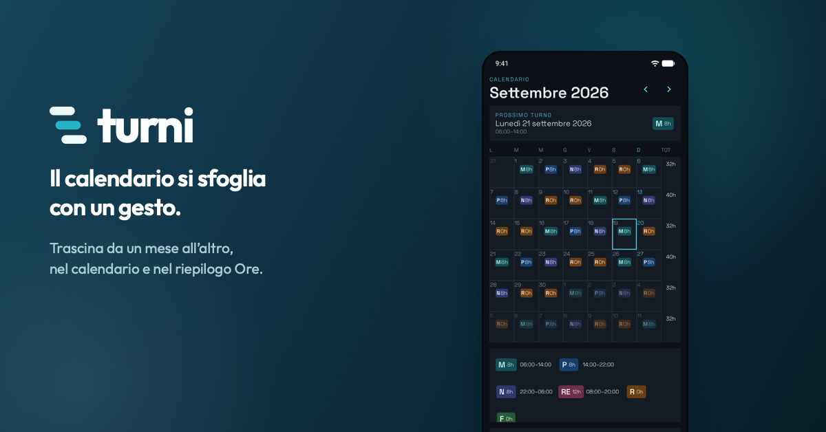 Product updates
turni
Swipe through the month in turni
Drag a finger across the calendar to move from one month to the next, and the same gesture works in the hours summary. The suggestion came from the first App Store review.
Read the article